Accelerate your Product Design

tldr;
Anytime you can accelerate your process, you save time and money. We found a way to accelerate the core UX work of Product Design by building a lean UI Component Library in Figma, based on the developers’ framework of choice: Mantine. Now, instead of spending weeks building and maintaining a Figma UI library that matched the developers’ components, our Product Designer could focus on the higher-value work of improving the User Experience. And we made it free so your team can use it too.
Why create another Figma component library?
While developing BonFHIR, we needed a way to align both engineering and design components. We chose to build our BonFHIR components using the Mantine framework because it provides a set of accessible and customizable React components.
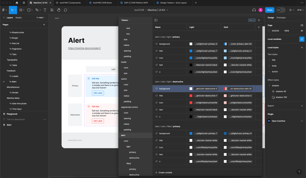
However, Mantine does not offer an official Figma file. Instead, they rely on the help of the global design community to create Figma components, as needed. The results, predictably, have not been ideal. Most existing community Figma files are not up to date with the latest version of Mantine and none use Figma’s latest update to variables. We decided to build our own from scratch so that we could align our BonFHIR storybook components as best as possible to what a designer would use in Figma.
“Knowing this could help other designers, we now offer our Lean Mantine Library as a free Figma Community file.”
As this component library grew, we realized we were creating a core resource that could be re-used on future projects to accelerate the design and engineering process, saving time and labour. Knowing this could help other designers, we now offer our Lean Mantine Library as a free Figma Community file.
How does this help you?
1. Faster product market fit
As a product designer, my main focus is creating a great user experience. That includes ensuring that the design looks visually appealing so that it is perceived as easy-to-use and a quality product. So I also need to spend time designing the UI (user interface) details: the colours, the weight of the strokes, the spacing between buttons, the scale of typography, etc. Still, the UX flow takes priority because a beautiful product that does not solve the issue is inevitably useless.
For new products or services, it’s important to validate whether your idea has product-market fit. The best way to do so is to get users to test it early on. The user feedback you then receive can help you make iterative adjustments to your product definition.
Using a pre-existing component library allows designers to quickly prototype and iterate on designs by leveraging pre-built components. It also helps them focus on high-level design decisions rather than spending time recreating basic UI elements. However, most free libraries are developed by a single designer who does not have the time to keep up with Figma’s new features and systems, so they are soon out-of-date. As a result, designers end up fixing them or building their own from scratch. This can be a huge time-sink.
By contrast, our Lean Mantine library will be maintained regularly as it continues to be used by our team of designers for new products.
Each component of our Lean Mantine Library offers multiple component variants, states, and properties for designers to use so they can focus more on innovative design solutions and user interactions and create high-fidelity prototypes faster.
2. Streamline communication
The Lean Mantine library is not only a benefit to the designer but also for engineering. The components within our Lean Mantine Library follow the same naming and variable specifications as the developer documentation so that engineers can easily and efficiently understand and recreate Figma designs.
Both design and engineering can also share a common language because the Figma and React components are defined in the same way and are created with local variables which can be interpreted and implemented as design tokens. This can help reduce errors and misunderstandings between both teams.
3. Consistency and better scalability
The Lean Mantine Library was created using Figma’s local variables feature so that it was easily customizable and ensured consistency across the whole library of components. All the UI elements use the same set of primitive variables and local styles, which makes changing the visual branding of the components fast and efficient. Using local variables gives you the flexibility of customizing properties on both a small and large scale. You can change the overall colour theme of the library to fit your brand, or simply change the colour tone of a button. This enables you the versatility to adapt the component library to your desired look and feel. More importantly, you can make dynamic changes to multiple instances simultaneously across all design files once your product grows.
To save time and resources, an up-to-date component library is a great tool to accelerate your overall process and turn your ideas into reality. Later, you’ll be able to validate your ideas and iterate more quickly through more efficient communication within your team. As you grow, a well-structured component library will ensure a more cohesive user experience across your whole product.
Try out TobogganLabs' Lean Mantine Library for Figma today.
Product Design at Toboggan Labs is tailored to streamline product development so you can get to launch more efficiently.